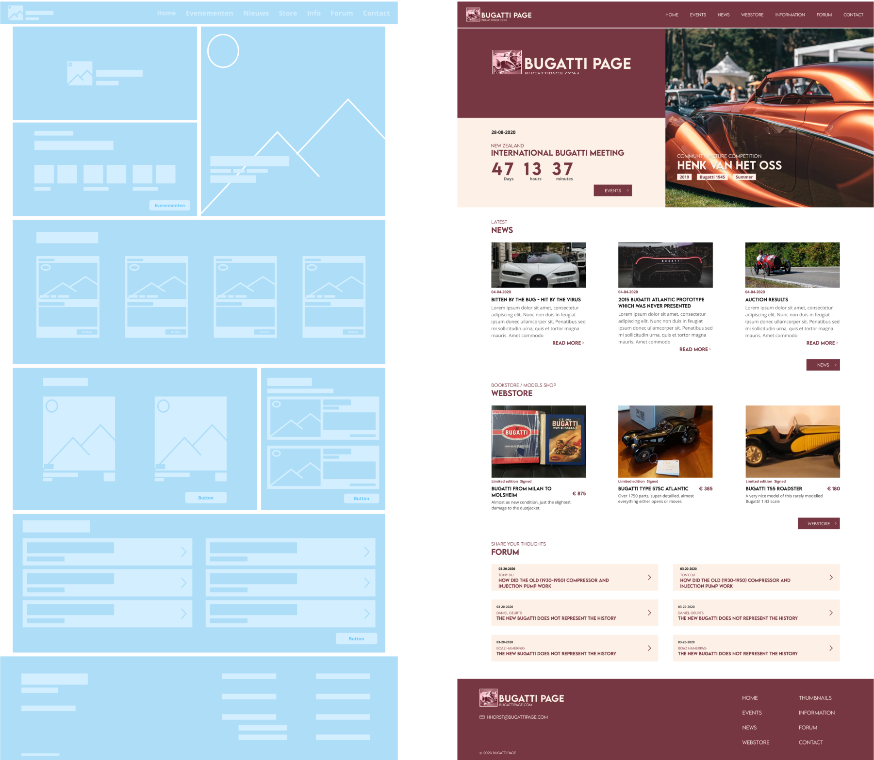
The assignment
For my exam I got the assignment to make a whole new corporate identity, logo, Graphics and Website for Bugatti page. Bugatti page is about the history and current news from Bugatti especially for classic Bugatti’s. Bugatti page also sells some products and organizes events, that’s how they make money. I had to make sure that these categories are better than the competitors.
Research
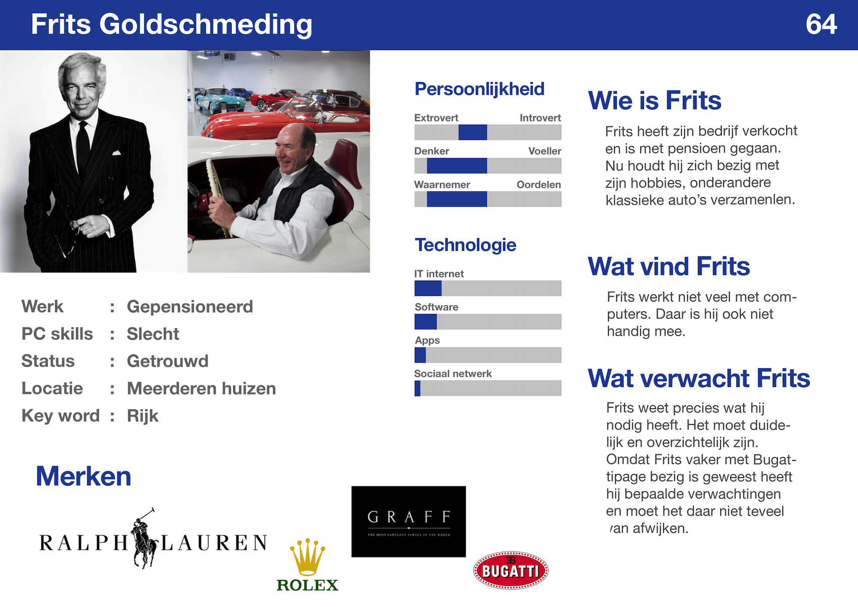
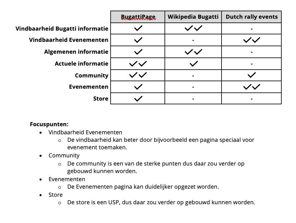
I did a lot of research for the total time that I had. I researched a target demographic and made 2 Personas. A rough estimate for the target demographic was already given by the client. The target demographic was around the age of 50 and divided in to 2 categories people that have a classic Bugatti and people that have a passion for Bugatti / classic Bugatti’s. For the personas I looked at the other websites that the target demographic uses and design they look at on a daily basis. Especially for this demographic I looked at their PC skills. I also looked at Bugatti page competitors, but I found out that they don’t have direct competitors so I divided it in to 2 categories, Event organizer and Bugatti information sites. I made a chart to compare competitors and withdraw focus points. For design inspiration I also looked at media expressions from competitors.
Concept
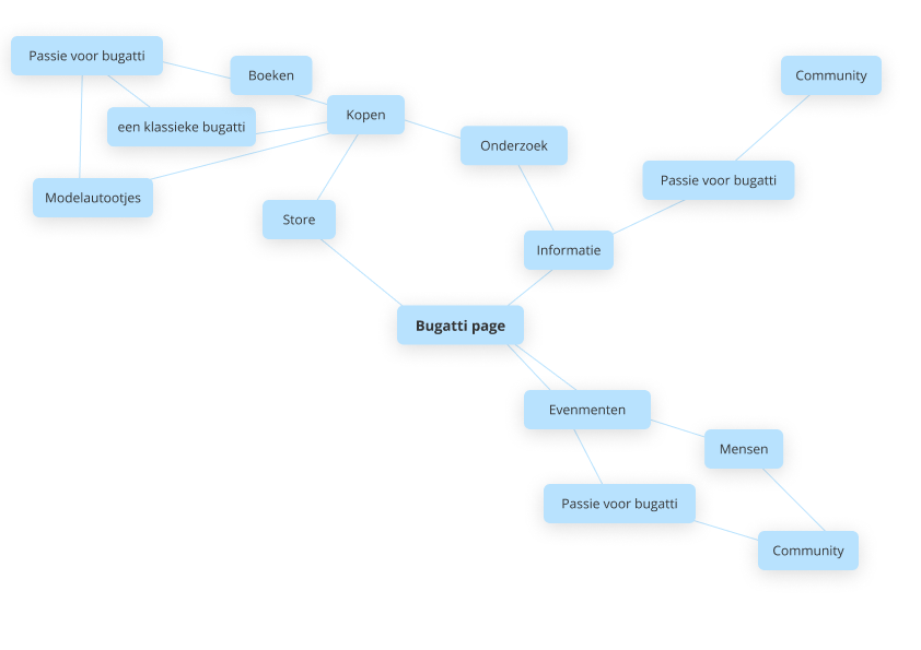
I made a mind map to help me find a concept that fits for Bugatti page. In the mind map all the categories ended up at community. So that’s why I choose to focus on community like a forum page and a photo competition on the front page. I also looked at other websites that also have a combination of organizing events and community.
Style guide/Visual design
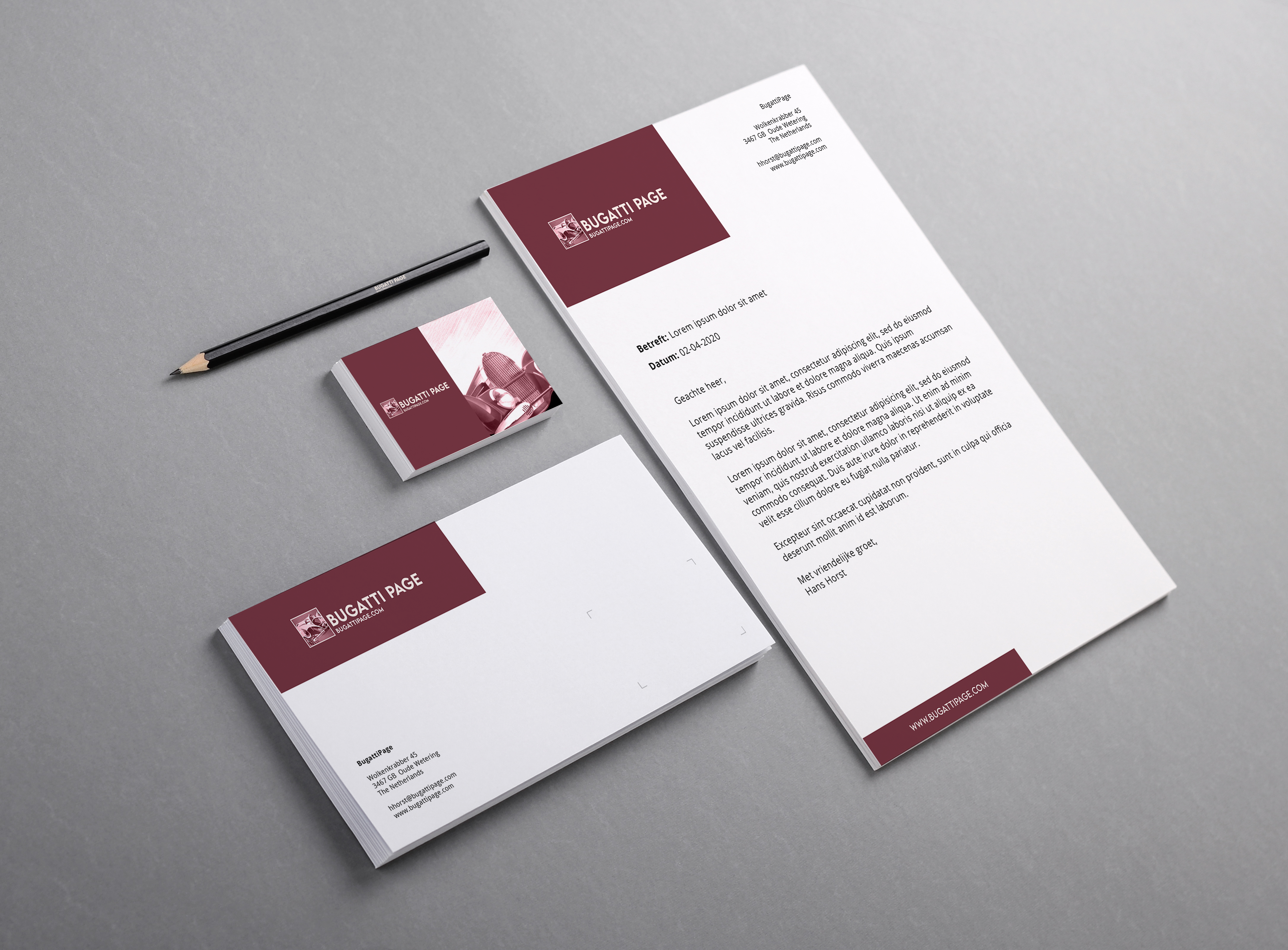
The client had some pointers for the new style guide. Like the old Bugatti style (1920-1950), but it can’t include the actual Bugatti logo and style elements. So I mostly looked at the posters for that time for font and color inspiration. And after making the style guide I made the logo and thecorporate identity.
UX/UI design
The primary focus of the UX is on the target demographic and making it the best experience for them. I looked at readability, so none of the fonts smaller than 16px. Because the site is reasonably big I didn’t want the user to get lost so, I made a big header with clear title and navigation links. For the community elements I choose to make it as easy as possible. So in the site you cannot make an account because I think that would make it more complicated for the older demographic. And for the UI design I mainly focused on making it spaced out and the text not to cluttered.
Coding
I coded the whole website my self with HTML, CSS and jQuery. See the Site
