UX design
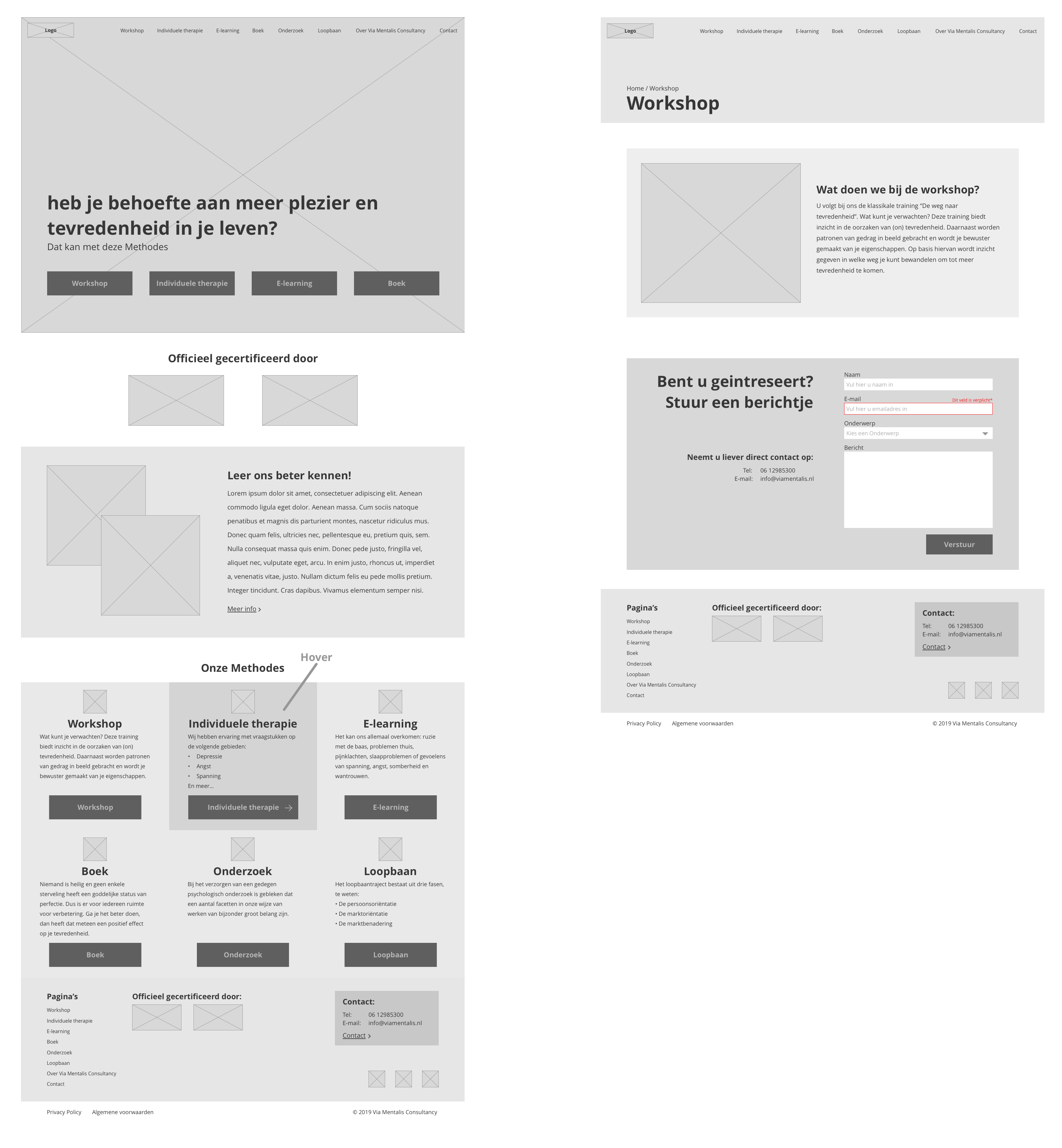
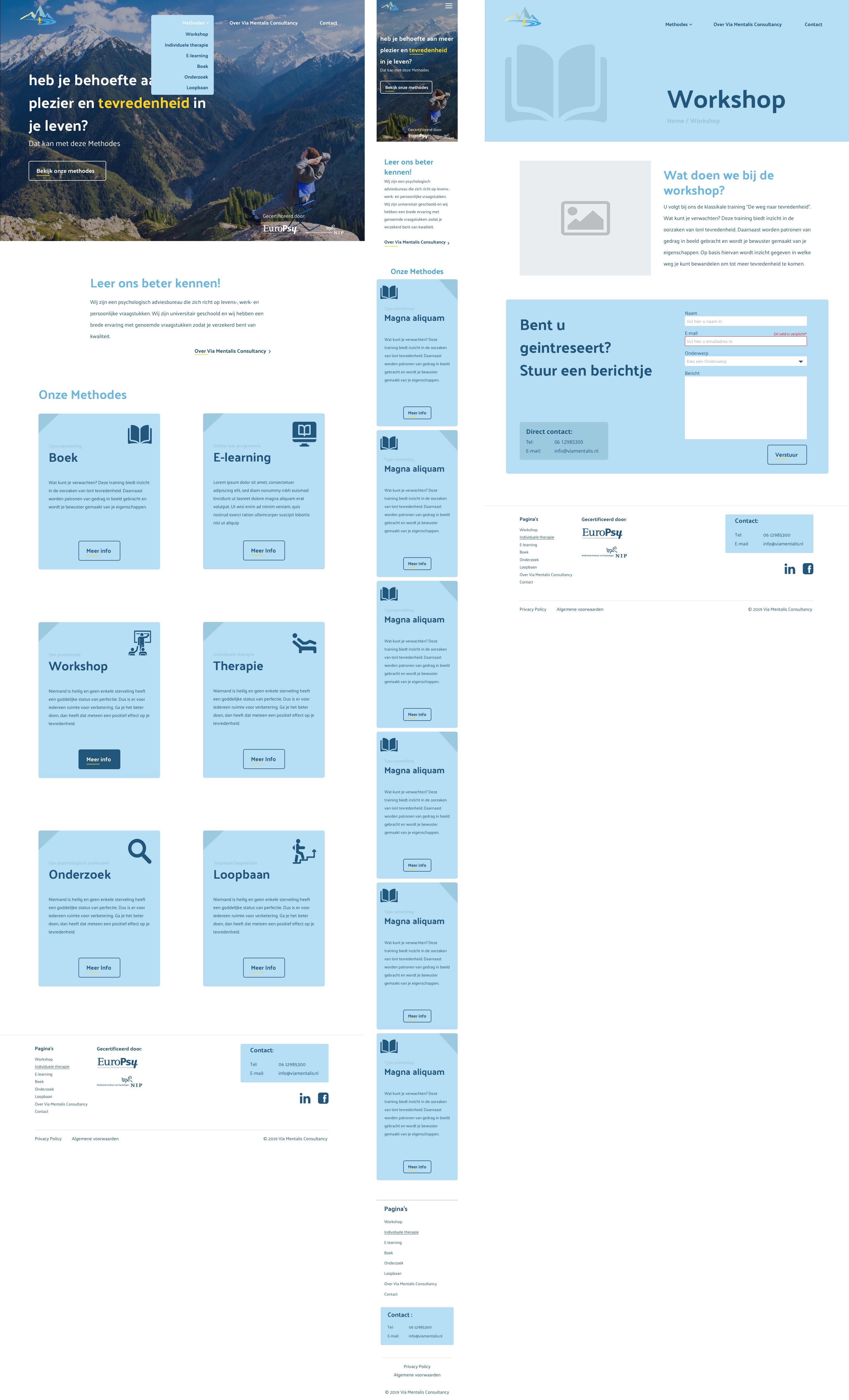
This website is for a therapist with a lot of products, so I had to figure out how to clearly show them all. I tried to keep the coding time to a minimum. That’s why I went for a template setup, but I still wanted to make all the pages feel different so people don’t get lost. That’s why I went for the big header.

